#2 – Collage: Why We Work Safely

Working Safe for Life

The construction industry in Seattle is a close knit community. Incidences resulting in death impact us all as people, not competitors. Such an incident occurred this week when a competitor’s subcontractor fell four stories. This incident could have been prevented had he employed safety procedures from his training.

As a marketer in the construction industry, safety communication is at the heart of my work. My company has been focused on eliminating accidents and injuries on our jobsites by changing the way we work and reinforcing safety as a core value. This has required a substantial communication effort, both internally and externally. I have supported these efforts by helping standardize on-site safety signage, developing graphics promoting safety and communicating our safety commitment to clients.

As noted in my first blog post, my topic for this semester is focused on construction safety communications, specifically developing content to remind colleagues Why We Work Safely. It is my belief that if employees are reminded about what they have to lose, they will reconsider their work plans and choose a safer alternative.

Collage Design

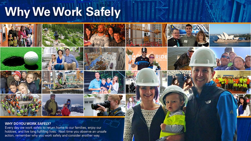
The goal of my collage (and forthcoming work) is to emotionally connect my colleagues to safety. Through authentic and relevant imagery, I seek to reinforce the message that we work safe so we can go home to our families, enjoy our hobbies, and live long fulfilling lives.

I started the design process by researching why my colleagues work safe. The majority shared family stories or hobbies they enjoy. Next, I started brainstorming and sketching out various layouts that may work for the collage and capture these feelings. This step was crucial to the design process as once I landed on a layout I liked, I could get right to work.

I have been experimenting with grids in my professional work and chose to implement this in my collage.  The background is a series of images that connect with the audience. I wanted the focus to be family and included more images featuring my colleagues.  I realized while laying out my grid I needed to include more construction images to make the connection to our work.

Notes 1-final
Brainstorming goals and layout.
Notes 2-final.jpg
Winning layout.

Collecting images was fairly simple, but documenting permissions proved difficult. Luckily, my company has used this concept previously so I had a library of family photos to work with. Construction photos were also sourced from work.  Hobby images were sourced from Wiki Commons as it provided simple ways to document permissions. I think the image selection turned out successful as colleagues will see their friends and family, their projects and really connect to the collage.

Execution

I have included a PDF of all the steps I completed, with screenshots that were used to create this collage.

It was fun to use Photoshop to build this collage.  In my professional work I typically use InDesign to create marketing collateral and only use Photoshop to quickly enhance images. This project reinforced how dynamic this software is.  I did not run into many challenges; however, I did find manipulating so many images tedious. I also wasn’t able to get the look I wanted on my hero family, but intend to further develop the image for my final draft.

I did encounter one challenge while creating my blog post.  Apparently my theme doesn’t support images over 800 pixels wide.  Therefore, my original image which was 1920px by 1080px turned out smaller in my blog post. The image I share with colleagues will be sized to fit their monitors.

I look forward to your feedback!


Image Credits:

10 responses to “#2 – Collage: Why We Work Safely”

  1. This is a very good idea because it affects our daily life. We all need to work in a safe environment. Ideally, we should include safety as a topic in all levels of education. With safety in mind, we will prevent most if not all fatalities and all issues originating with ignorance of safety measures. I like an environment where I feel safe because there is a safety layout and a rendezvous place in case of anything.
    However, in this photographs and illustration (why we work safely) there seems to be only three photos that illustrate safety because we can see the people in headgears and safety clothing. The rest of the photos are of people relaxing probably because they feel safe in a safe environments or just posing for photographs.
    The illustration cannot be read out well and are hard to understand and the drawings are unsystematically arranged. In such a scenario one can depict an unsafe environment and perhaps understand why we need to work safe.
    The best illustration for this good idea should be a plan of an escape route incase of an emergency and where to assemble. This will complete the message about” Why we work safely”.

    Like

    1. Thanks for the feedback, Joy. You made me realized I’m not making the connection to construction I thought I was. I hope to change this by making the construction/safety photos larger in the final draft.

      Liked by 1 person

      1. My pleasure. i have learnt something to that two heads are better than one.

        Like

  2. Laurel Brishel Prichard Avatar
    Laurel Brishel Prichard

    Hey Bill! First off great collage! I really like the layout and I think the topic is very important as well. I can relate to a degree about safety in the workplace. I work at Coors Distributing Company where safety is our number one priority whether its the people driving the trucks, picking the beer or any other staff in the building. I really appreciate the step by step walk-through you posted, this is such a helpful tool for understanding your process and seeing other tips that I may be able to use in my final draft.

    I think the emotional connection is very well done and will make people stop and think before doing something against procedure or just overall risky. The only critique I have, which is a small one, would be to possibly increase the font size, or maybe bold, on the Why We Work Safely verbiage at the bottom. It is a little hard to read. Overall though great execution!

    Like

    1. Thanks, Laurel! You’re spot on about the copy. I’m going to move that around and try different text effects. Also, I’m glad you’re staying safe at Coors – I need my beer!

      Like

  3. Bill, I really appreciate reviewing something relative to my field. I also work in a marketing department, even though my position is mainly Social Media, I get to stick my hands in the marketing/communications pot as well! This image has a strong emotional appeal to it using things that mean a lot to many employees, such as family, hobbies, and to live long fulfilling lives! The color choices of the blue background and orange lines to separate it make the pictures stand out well. The pictures you chose work very well, but I also think there could be a couple adjustments to them. It seems like a lot is going on and at first it was hard to focus with all the graphics. Some recommendations I would make is to possible to less photos and make them larger or every other you could make black/white or add some sort of effects to some of the photos to make them pop more. Maybe all the photos of family are one effect, while hobbies are another effect. The cutout of the family could use some enhancements as well, it would be cool to maybe add a glow around them so they stand out more and don’t blend in as much with the background photos. Also, you could add a company logo to the top right corner to add some credibility or help relate to why you work safely. Overall, I think the graphic has a strong message!

    Like

    1. Thanks for the feedback, Masey. When I finished the draft I felt overwhelmed by how many images there are. I’m going to rework my grid and am considering removing the hobby photos. I think the family photos are more powerful than the hobbies and it’ll allow me to bump up the size of other images. Also, I like the idea of adding color. That cutout family though…I’m finding I can only do so much with iPhone photos. Thanks again!

      Like

  4. Early in my career I thought I could create and finish quality marketing materials in one draft. I can remember how my boss would smile as I would walk away frustrated wondering how and why I didn’t nail the assignment. In hindsight, this was a valuable lesson for a young creative marketer and reinforced the value of the drafting and feedback process.

    When I uploaded my collage on Friday I was not sure what else I could do to improve it. Then I looked at it again, and again. I found some areas for improvement which were supported by the helpful and unbiased feedback from my classmates.

    My overall concern is that the collage is too busy. To remedy this, I am going to reevaluate my grid and am considering taking the hobby photos out completely. I like Masey’s idea of staggering the size of some images and using color selectively to highlight common elements.

    Joy’s feedback made me realize that I need to play up the construction connection. I intend to accomplish that by reworking my grid and making those images larger.

    Laurel brought to my attention that my copy is a bit difficult to read and I agree. I am considering moving this to the top right corner of the collage and bolding the copy. I am concerned this will make the collage top heavy, but it creates room for my next alteration.

    Masey made a good point about branding. I left the brand off intentionally as I wanted it to stand alone, but, since the collage will be used internally, it makes sense to add it. Our brand standards places logos in bottom left corners, so moving my copy makes room for that.

    Thanks for the feedback, time to work on draft 2!

    Like

  5. Hi Bill. Your viewpoint on the issue is a very important one. Every day I see that people forget why they do the profession they have selected. One of the officers I work with was discussing this with me recently. His focus is his family and he has to remember what the long hours are for. Being safe in our current environment is paramount and our Safety Officer is always running around doing something to try and remind everyone. He is working on effective products for the unit and trying to get everyone trained. Motorcycle training is critical for us. Especially here in North Carolina where it is sunny most days and young Soldiers that want to go fast without the years of experience. So I see your struggle to ensure everyone has a constant reminder as a challenging one and you are attacking it from an effective view point. I would suggest that you try to group the photos behind one idea together and then somehow putting that idea behind or on top of the photos, instead of having to read the fine print. Is there somewhere they can report unsafe actions to that might be included on the collage? We have an organization within the Army to report actions and on most websites there is a link to a form that we can fill out and submit so that the Safety Officer can review and investigate. Is there a function like that for your work? I’m so very sorry to hear about the sub-contractor and hopefully everyone is helping you out with your mission. Looking forward to seeing your results for your campaign!

    Like

    1. Thanks for the feedback, Anna. I’m going to play around with my grid and see if I can make it more clear and impactful.

      Like

Leave a comment